Back

/SkillX

Simplifying the journey from occupation discovery to skills assessment.

ImmigrationWeb & MobileBrand & Content
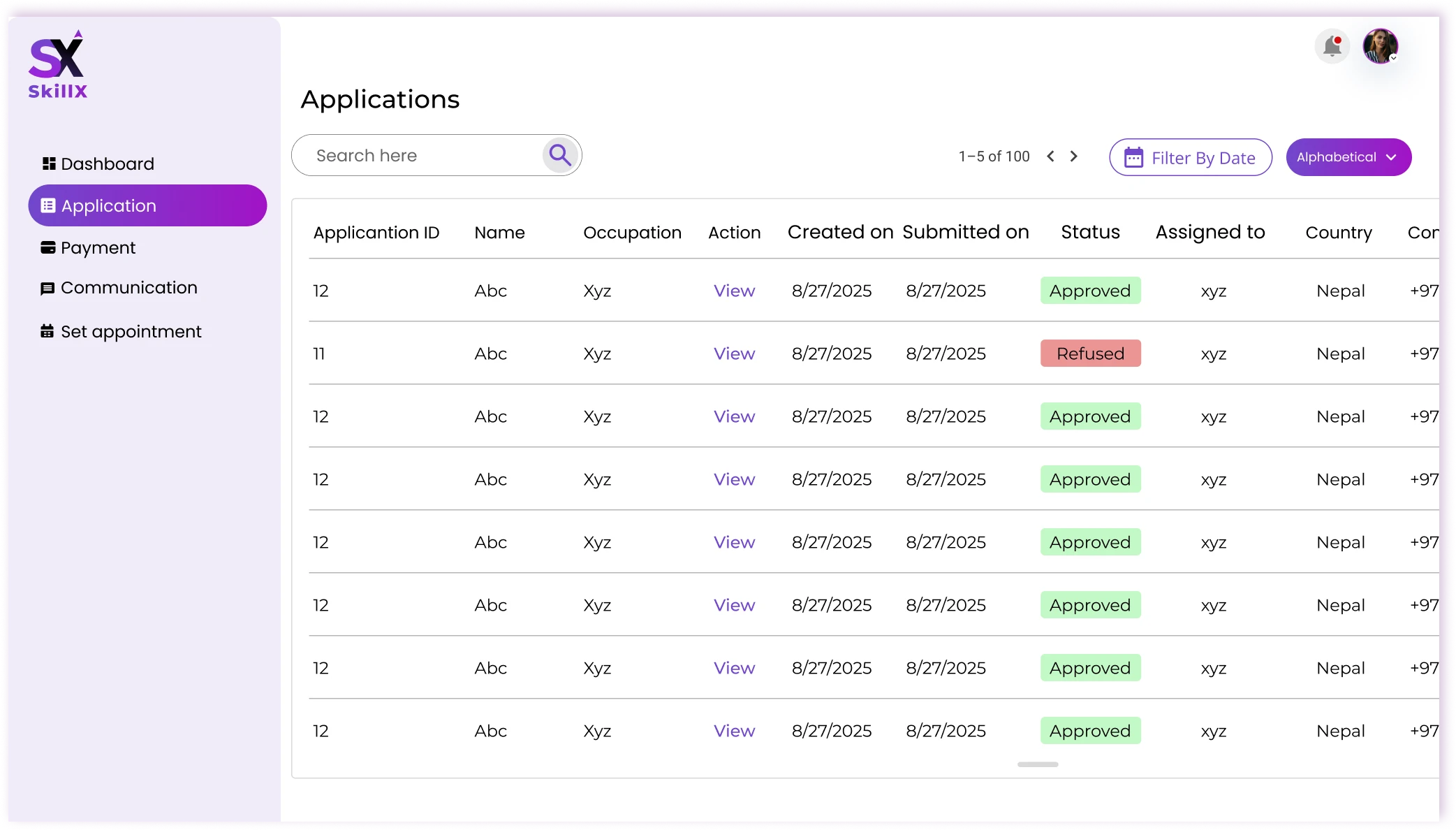
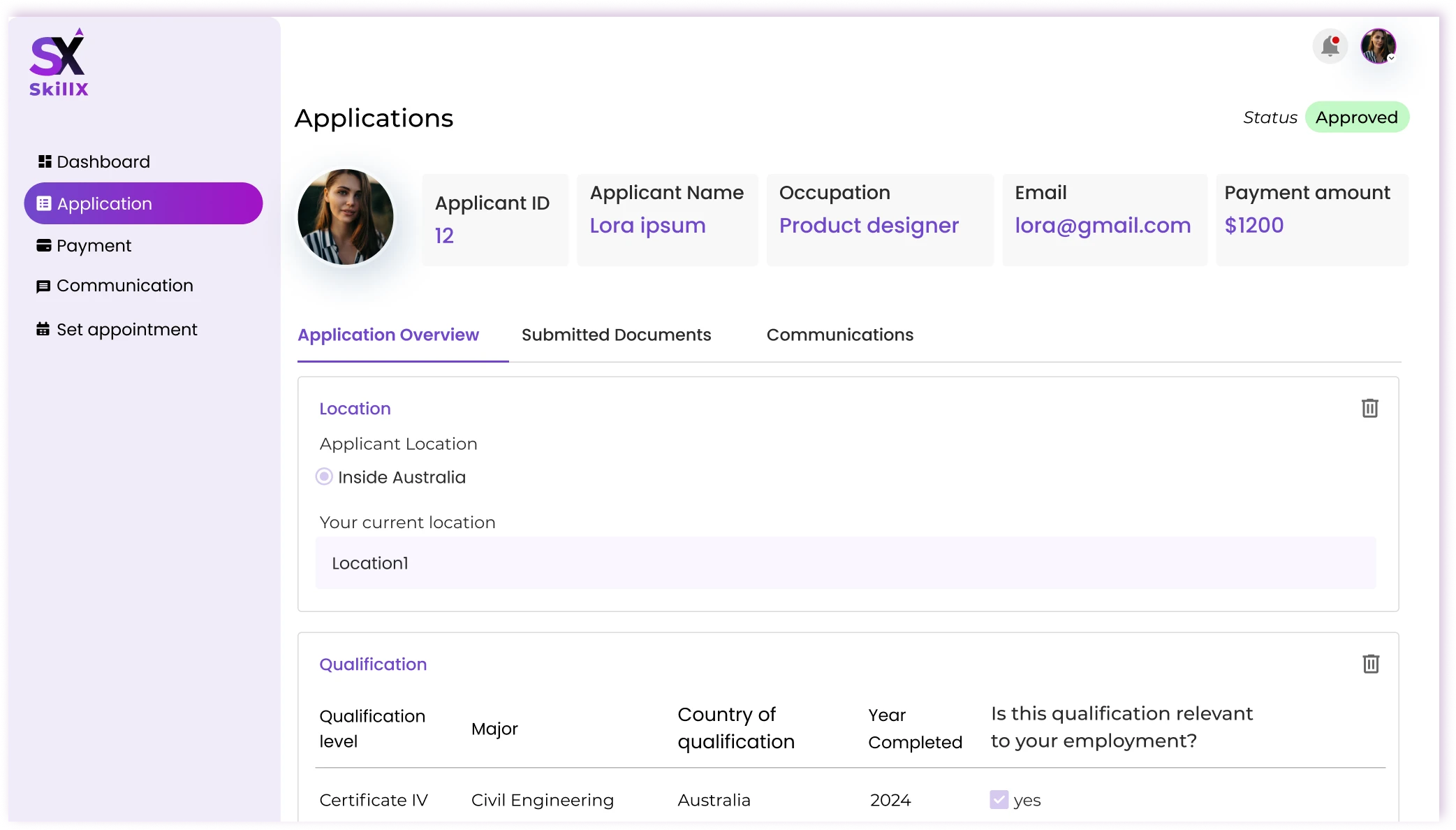
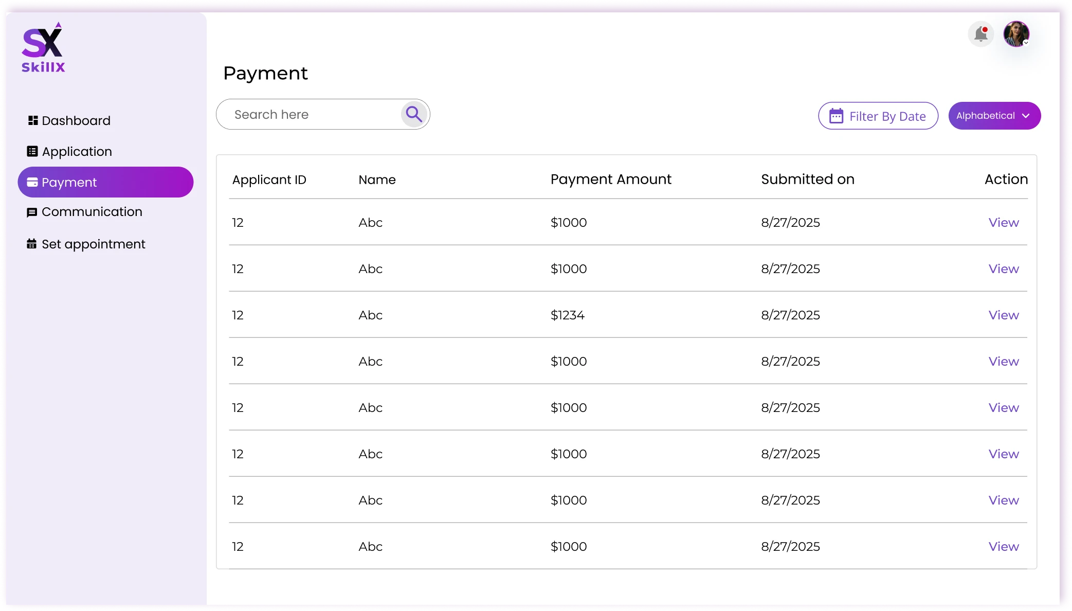
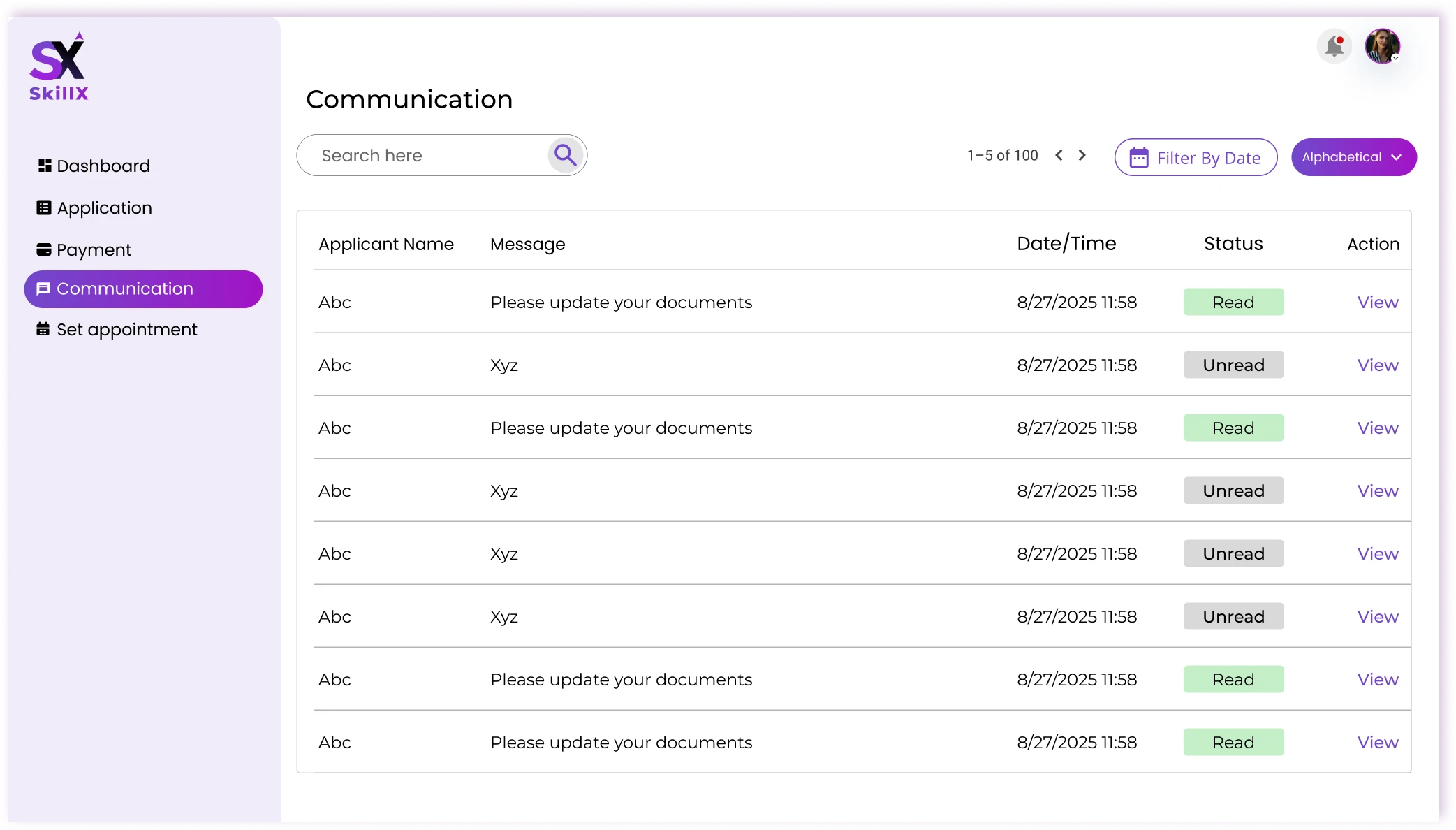
SkillX product screens
Design snapshot, 2025. The live product has since evolved.

Industry: Immigration & Education | B2C

My Role: UI/UX | Web Design | Logo Design

Multi-phase project over ~2 Months

Platform: Web/Mobile

/Context

What am I designing?

SkillX is an Australian skills assessment and migration platform. It helps skilled professionals find the right occupation, understand their eligibility, complete a formal skills assessment, and track their application — all in one place.

Audience: Skilled professionals, migrants, agents, and internal admins.

Goal: Turn a high-stakes, fragmented process into a clear, guided journey that feels manageable at every step.

/Challenge

What problem am I solving?

Skilled migration in Australia is complex, high-pressure, and poorly supported by existing tools. Applicants and admins face the same core problems from opposite sides:

  1. 01 — No clear starting point

    Visitors land with many options and rules but no obvious first step.

  2. 02 — Dense occupation discovery

    Long, static occupation lists are hard to scan and even harder to act on.

  3. 03 — Complex assessment

    The skills assessment involves multiple stages and document requirements with almost no guidance.

  4. 04 — Unclear points & eligibility

    People cannot see how their answers affect their points score or overall eligibility in real time.

  5. 05 — Scattered applicant tools

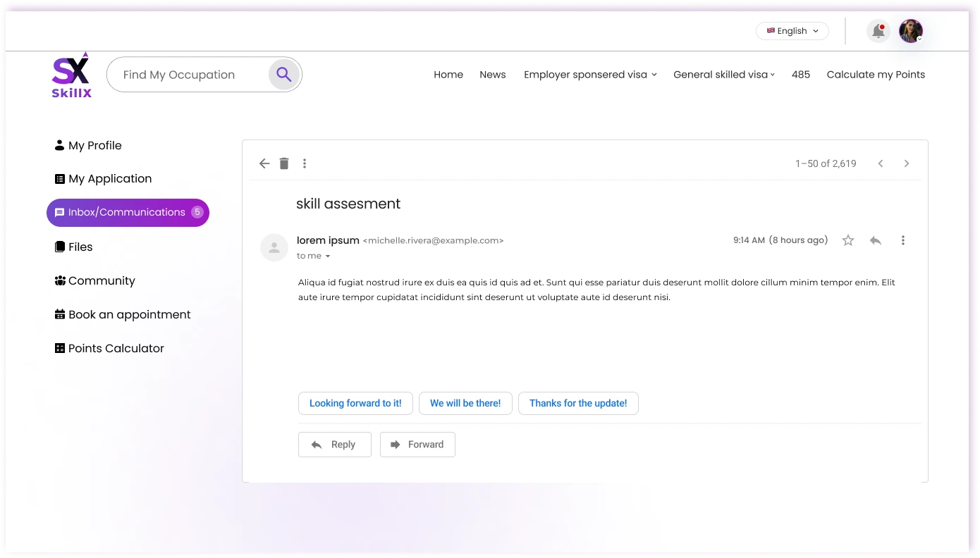
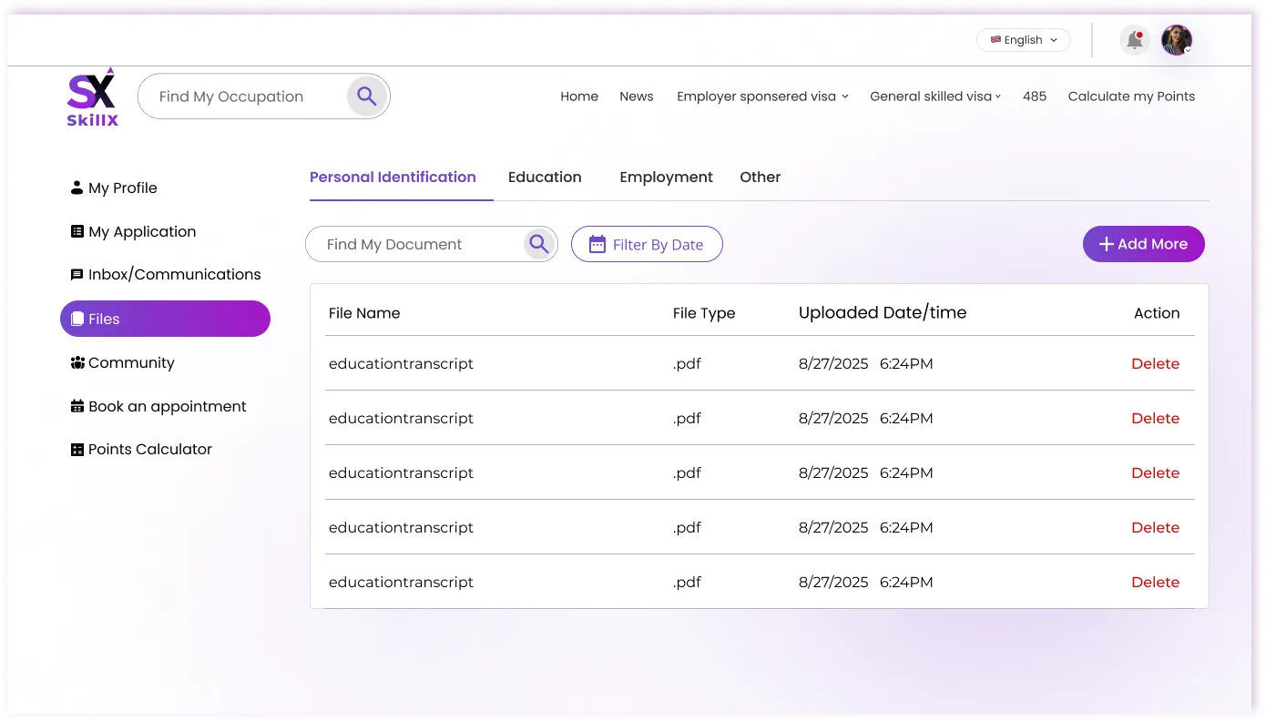
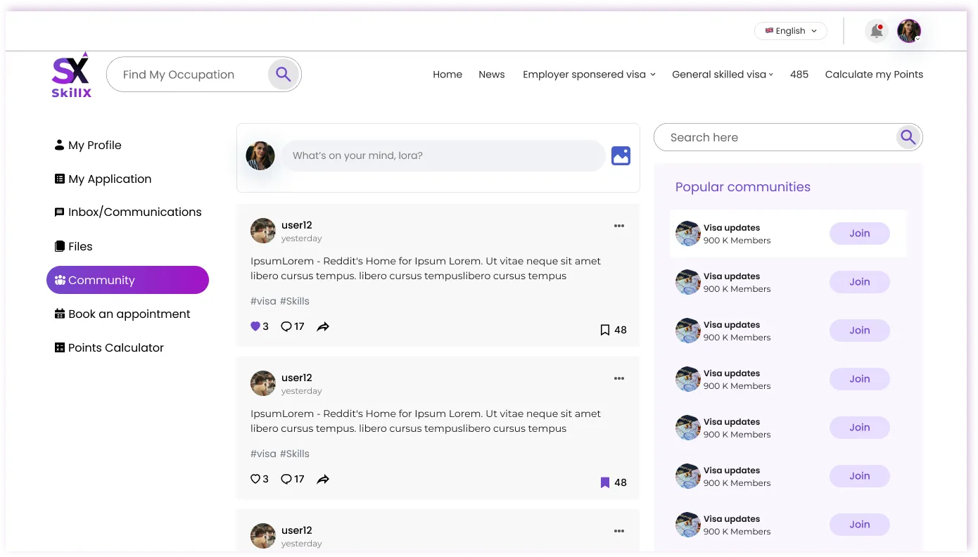
    Documents, appointments, messages, and progress live in different places.

  6. 06 — Limited admin visibility

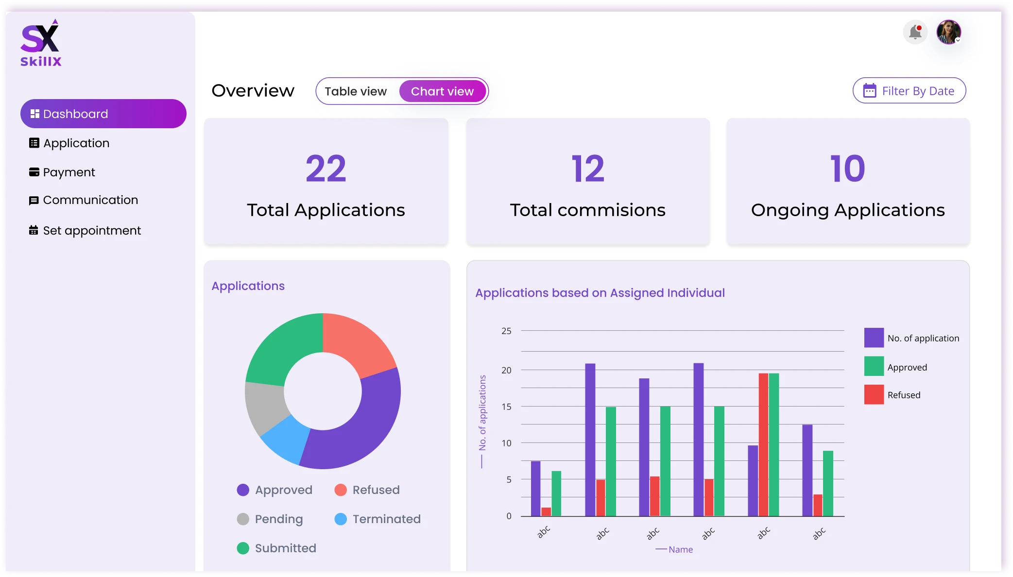
    Admins lack a single view of the pipeline, payments, and stalled cases.

/Design response

How am I solving it?

  • No clear starting pointClear entry points on landing
  • Dense occupation discoveryActionable occupation search
  • Complex assessmentGuided step-by-step assessment
  • Unclear points & eligibilityLive points calculator
  • Scattered applicant toolsOne applicant dashboard
  • Limited admin visibilityAdmin pipeline dashboard

Response 01

Create a clearer starting point

Challenge

Visitors don’t know where to begin.

Design response

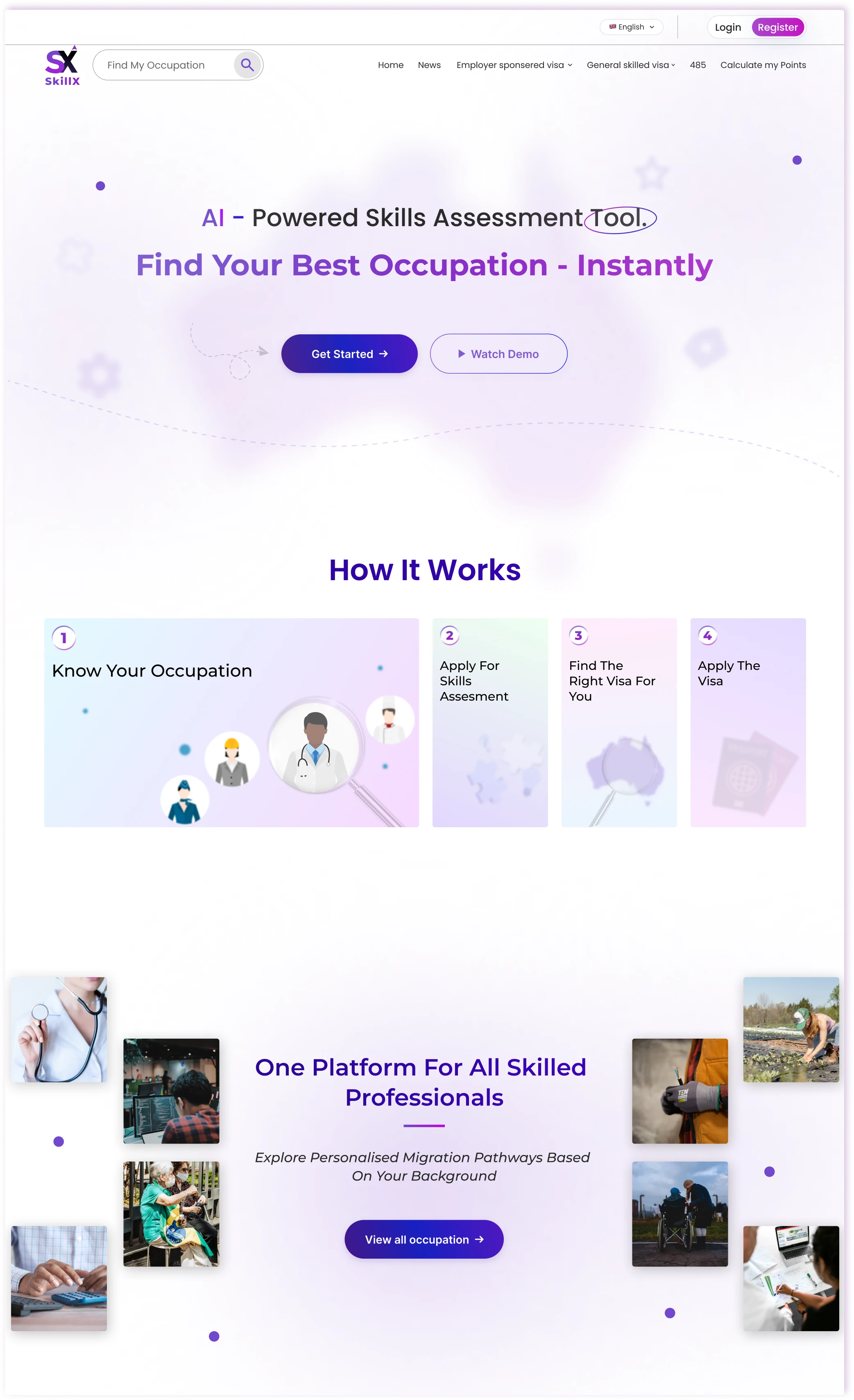
I replaced a generic landing page with four explicit entry points that match the most common user intents:

  • Find My Occupation
  • Check My Eligibility
  • Get Started
  • Calculate My Points
Response 02

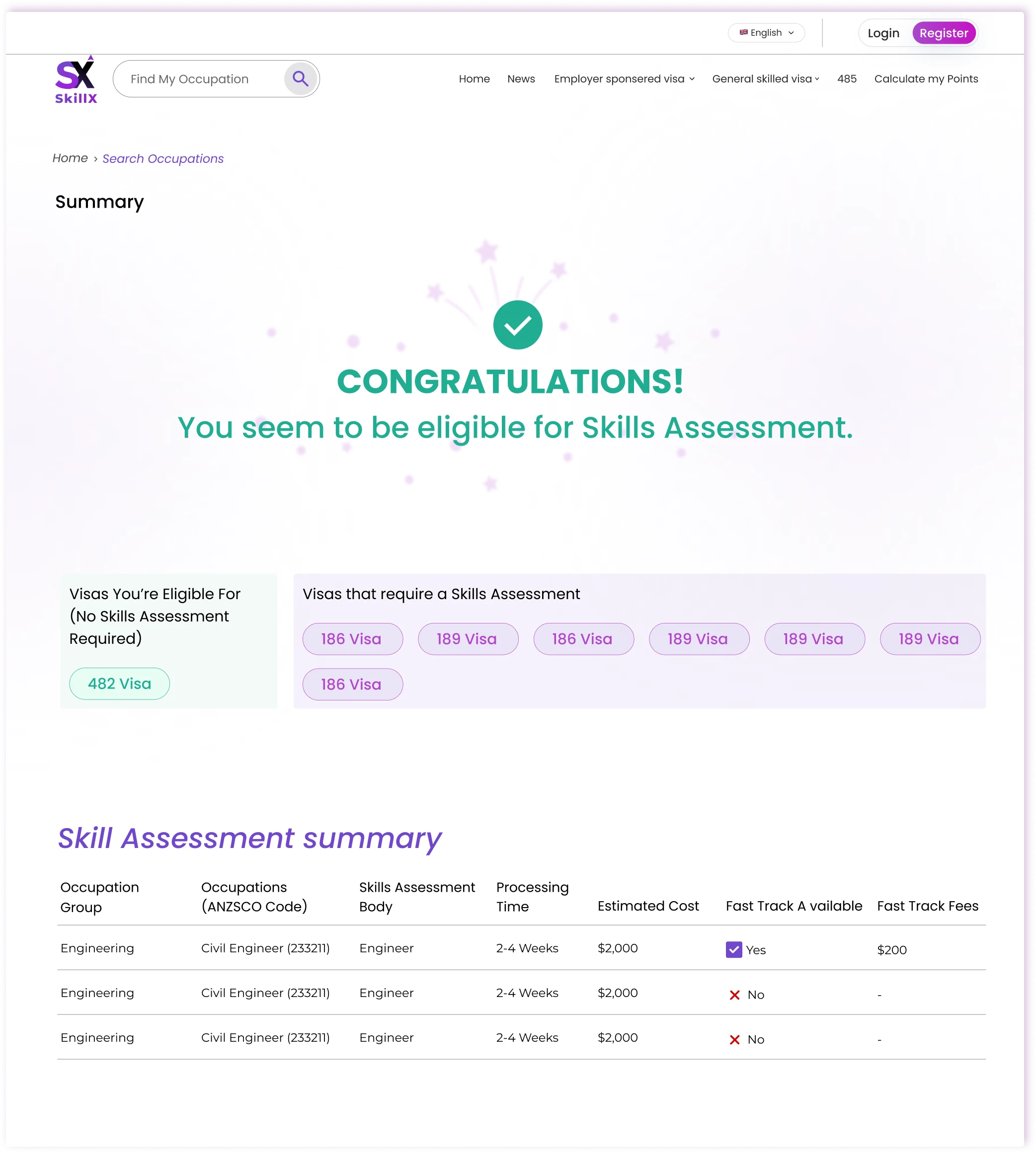
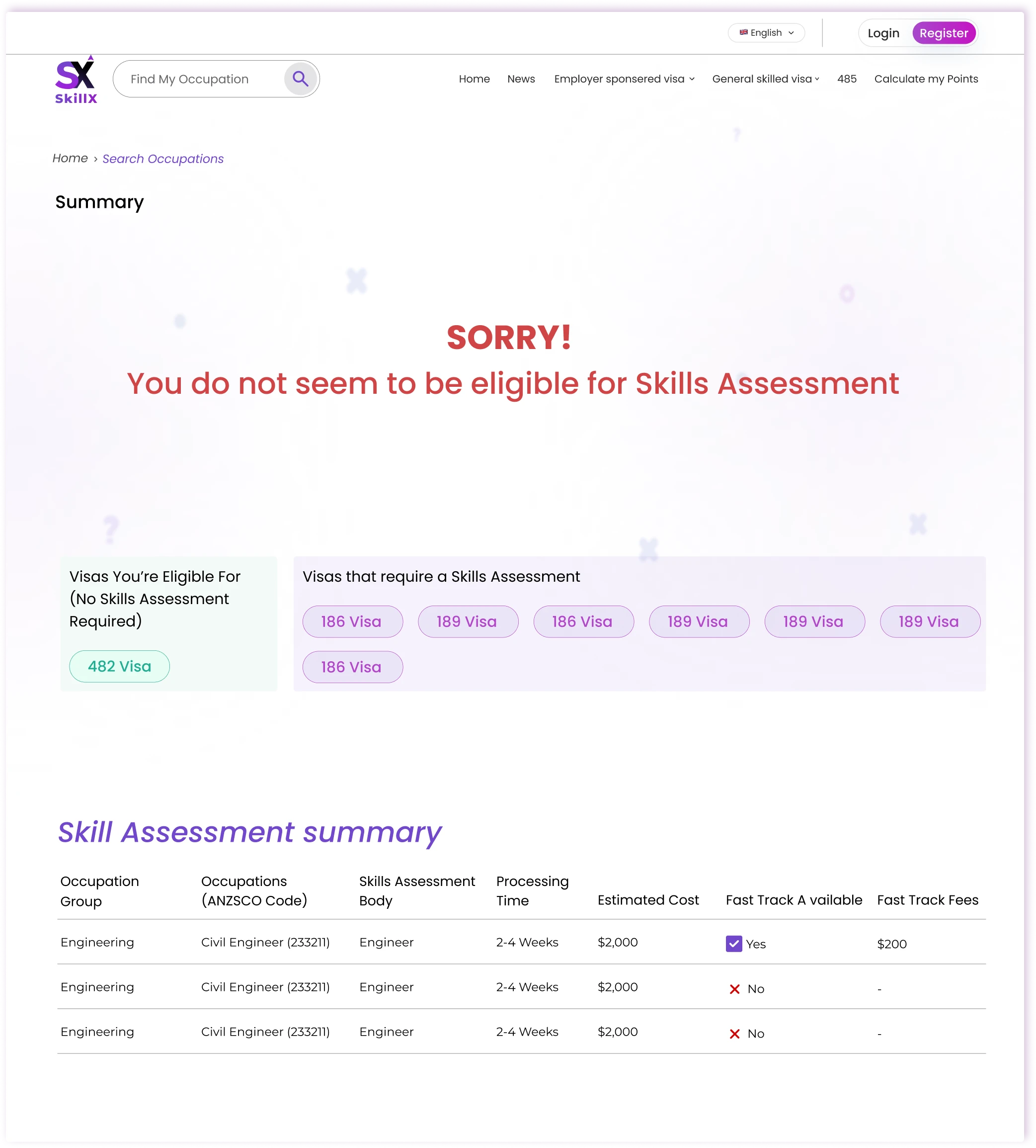
Make occupation discovery actionable

Challenge

Occupation lists are dense and hard to act on.

Design response

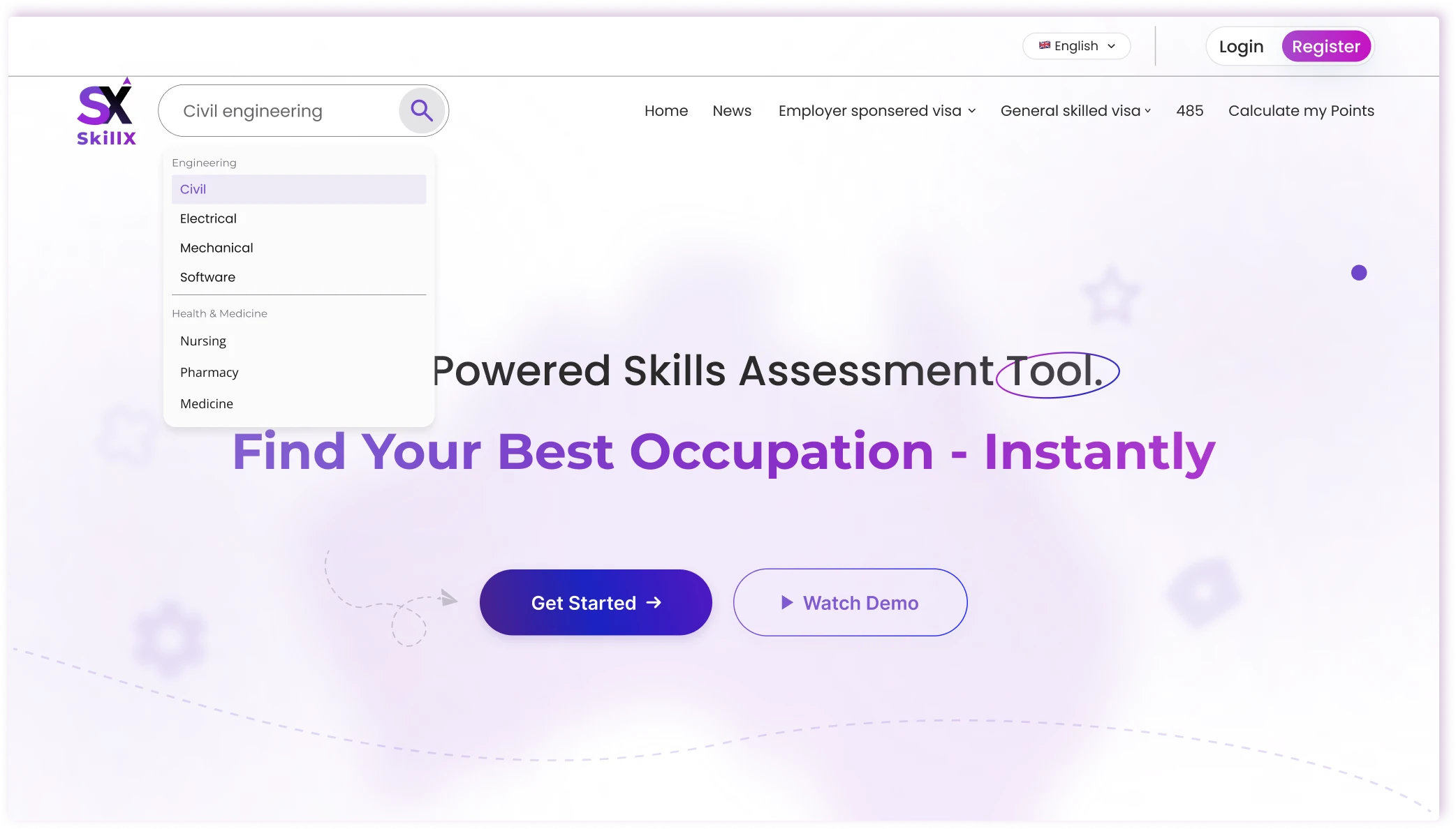
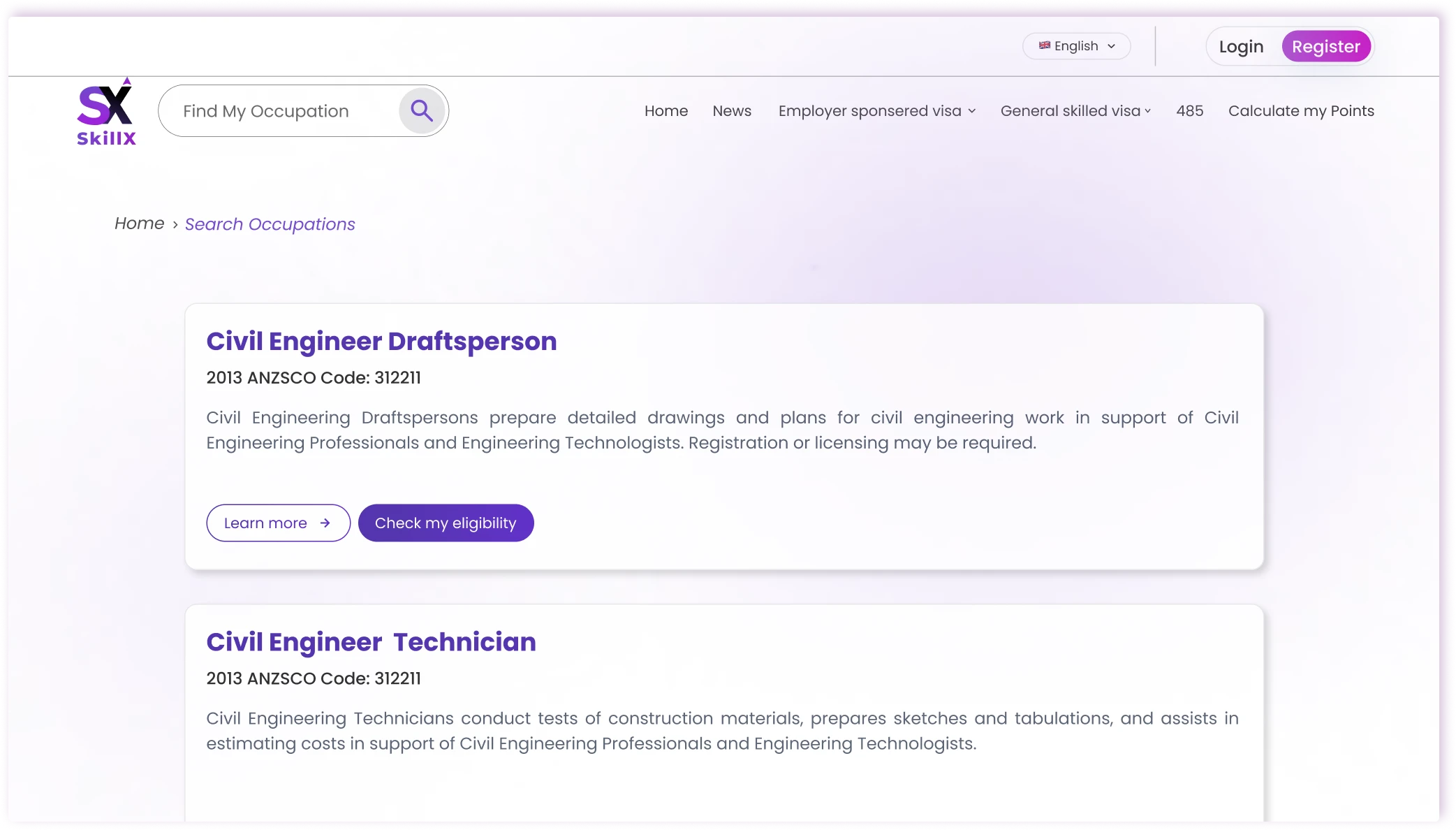
I designed a focused search experience with smart filtering and clear next-step prompts. Users can search by occupation name or ANZSCO code and immediately see relevance, eligibility signals, and the recommended next action instead of just a static list.

Response 03

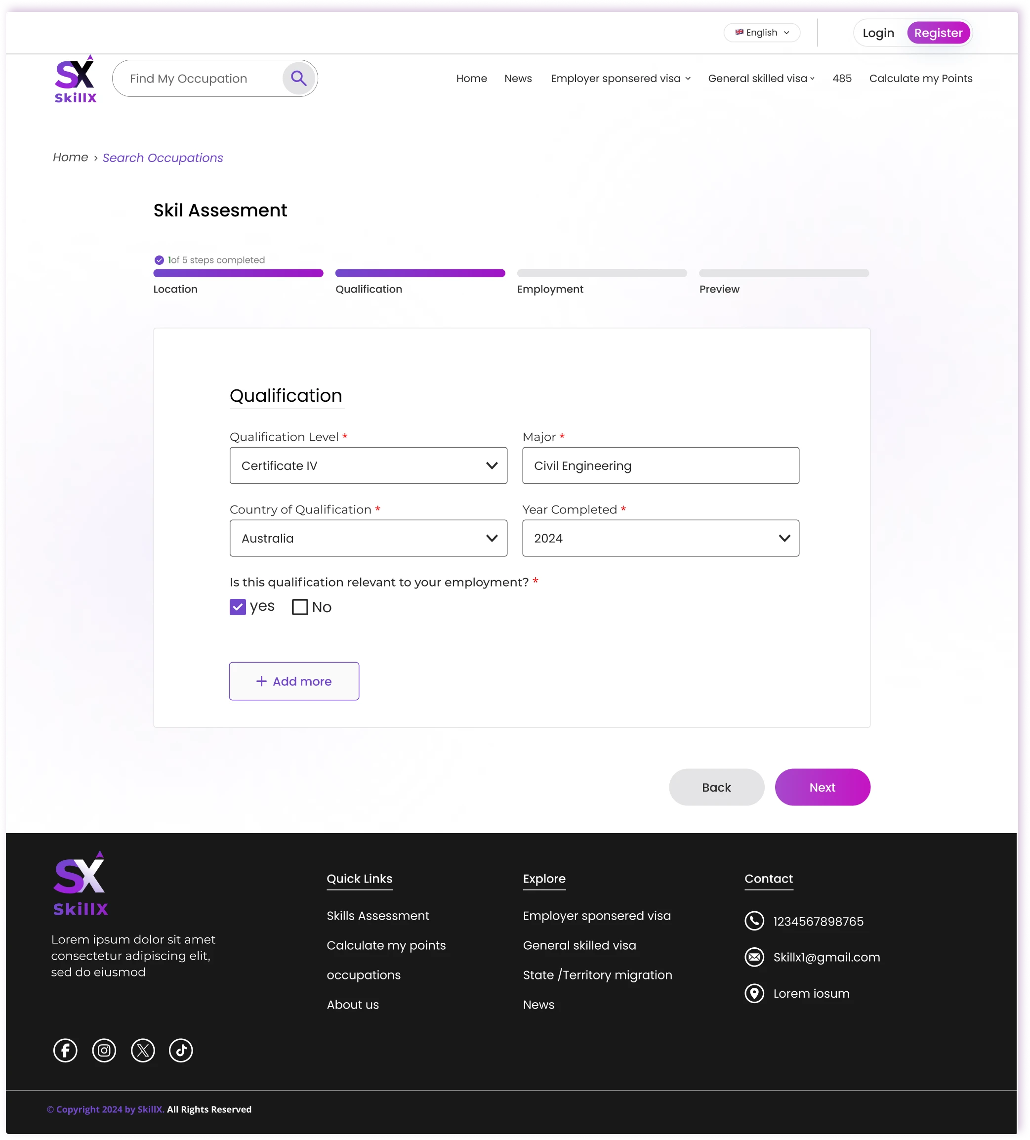
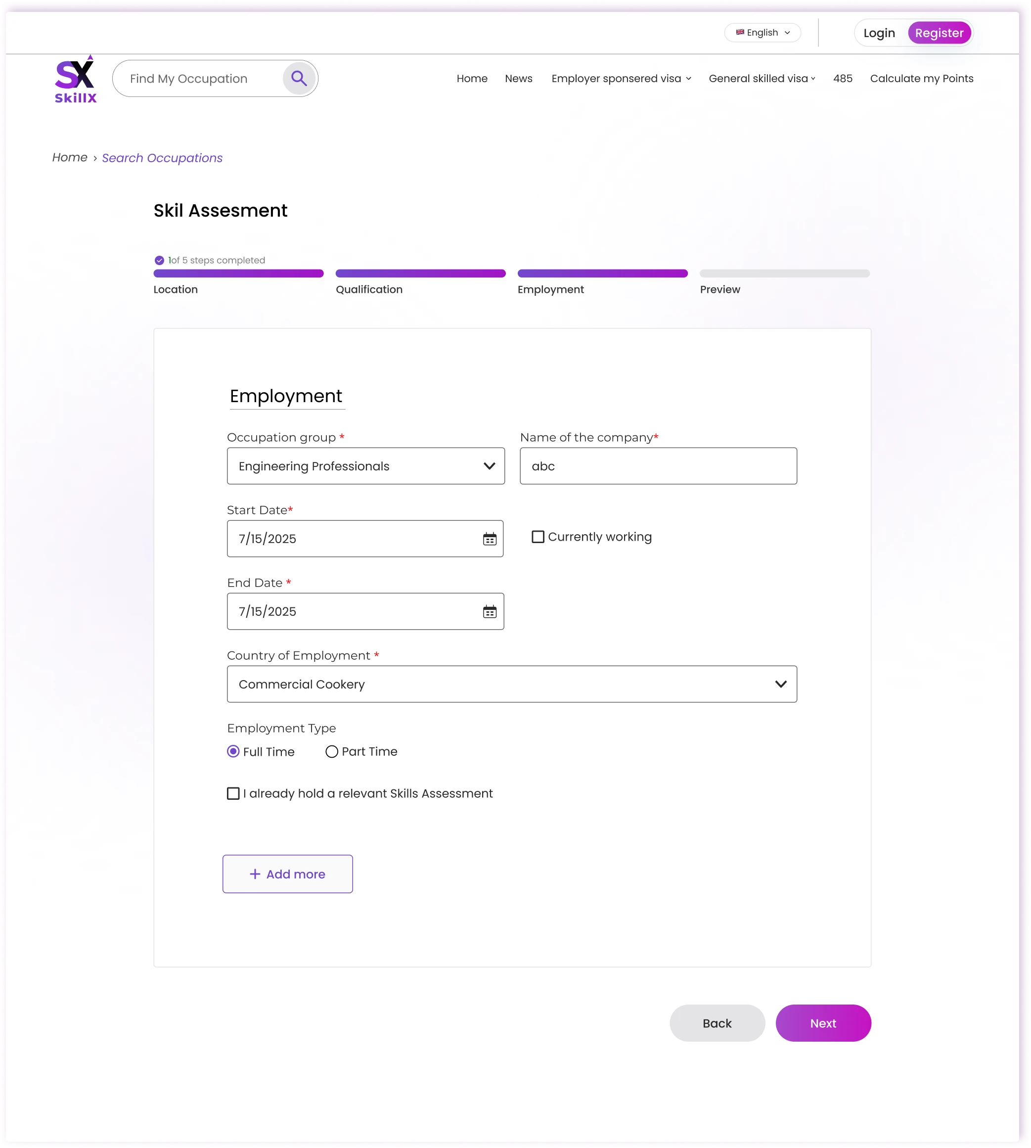
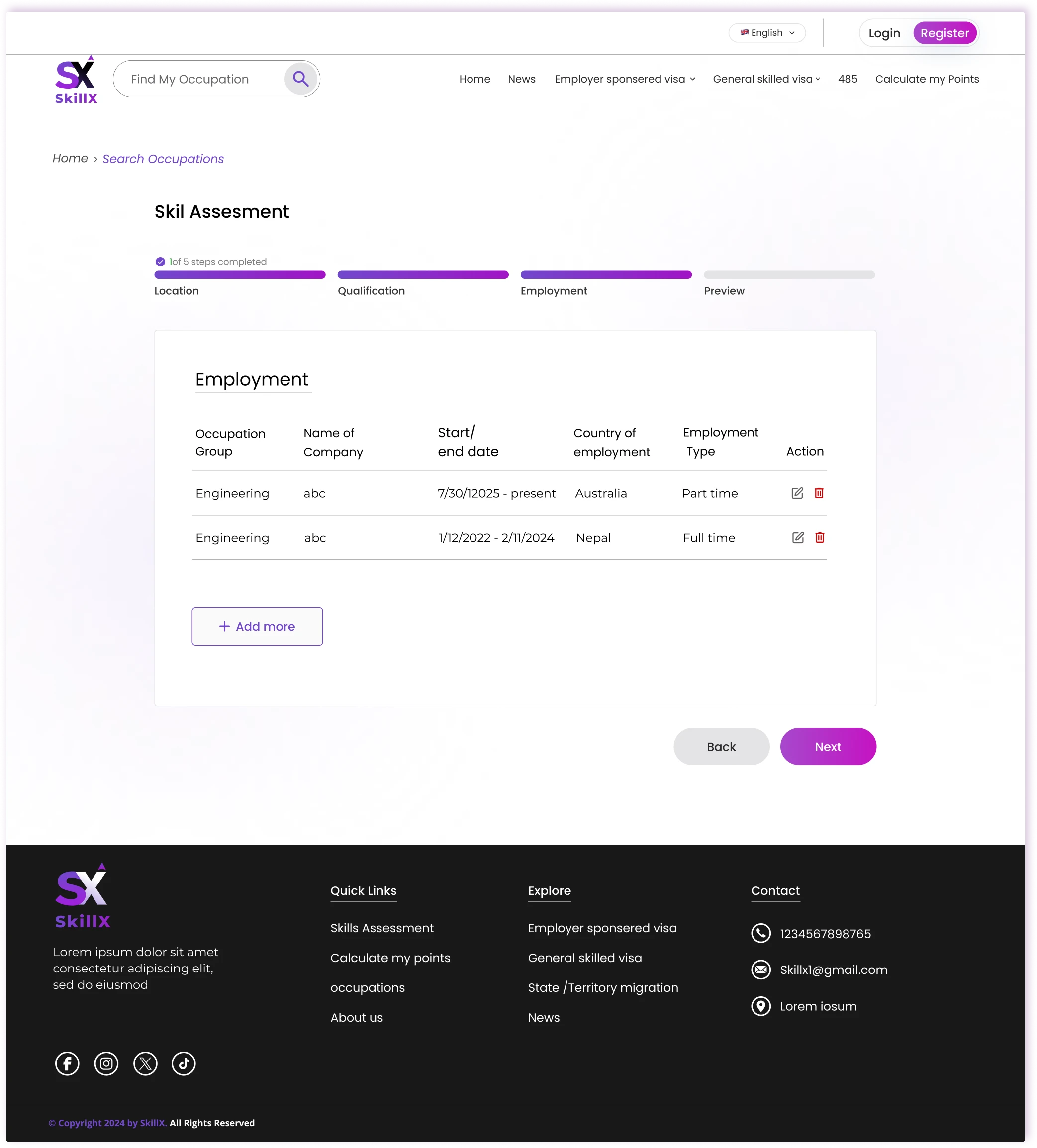
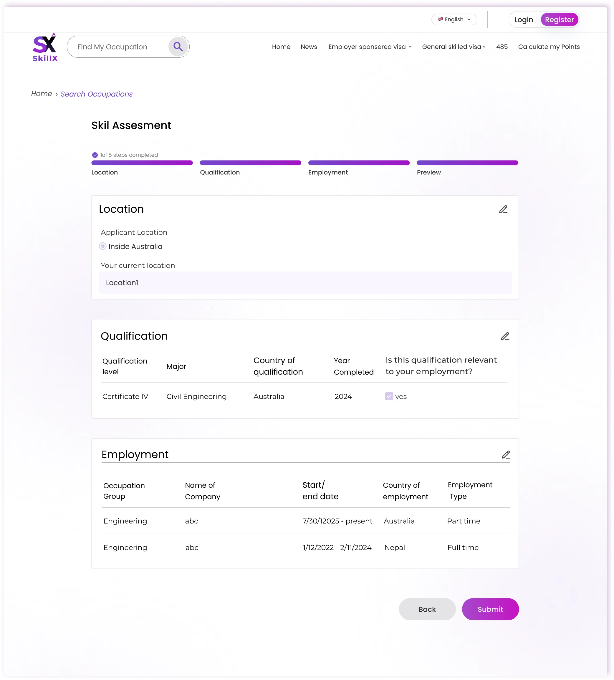
Turn assessment into a guided journey

Challenge

The assessment has many steps and documents.

Design response

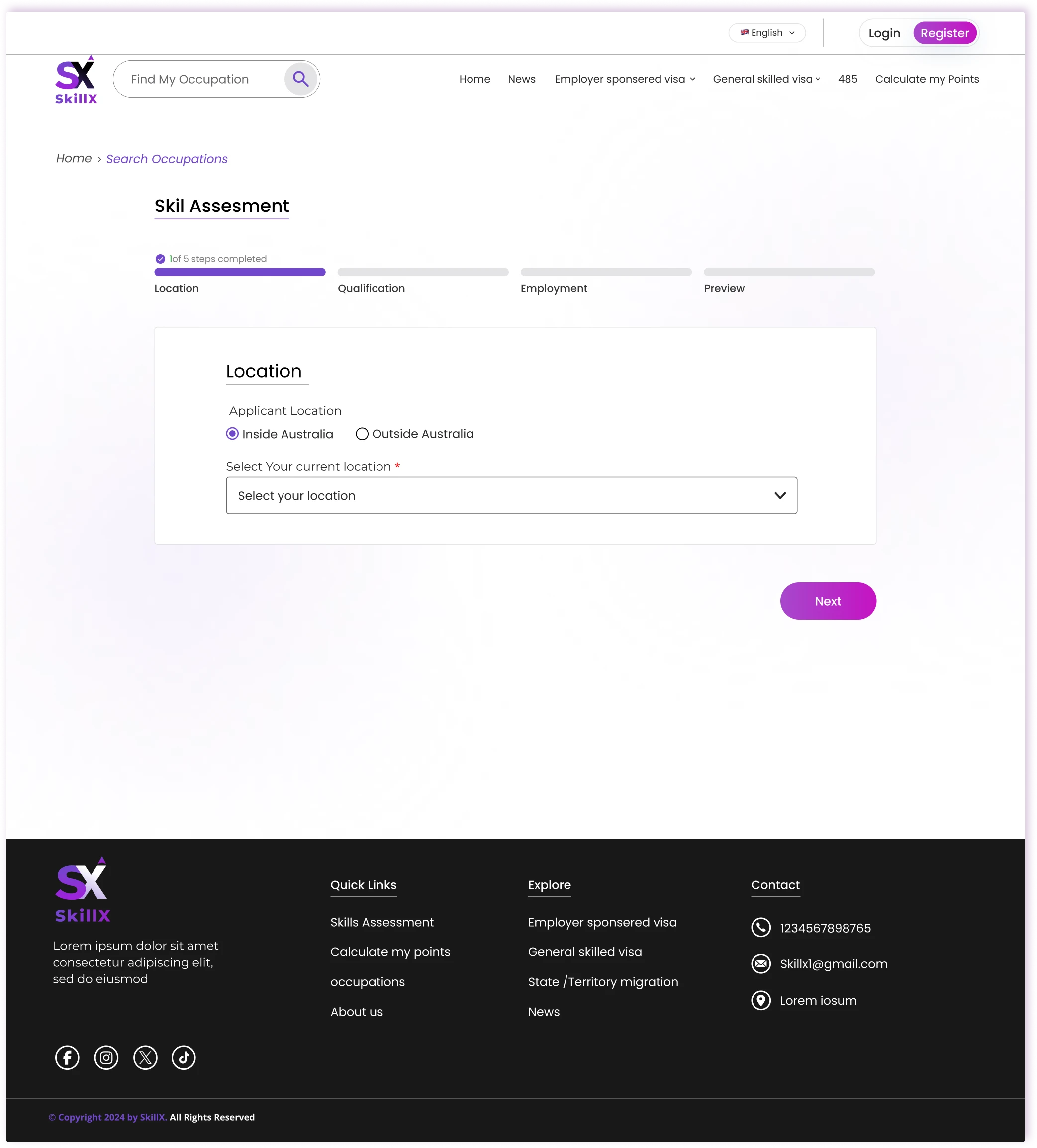
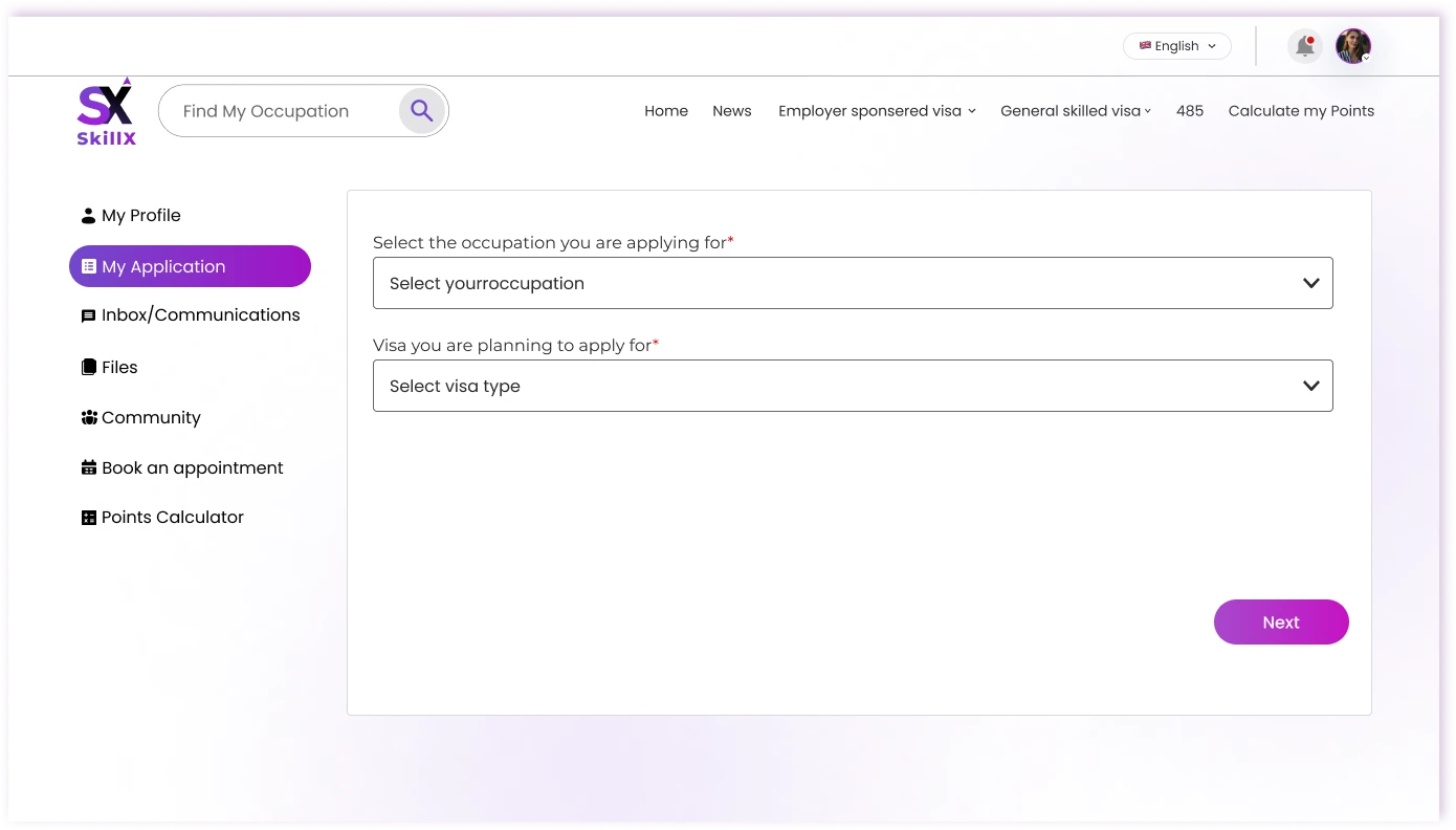
I broke the assessment into short, progressive steps with built-in document upload and clear progress indicators. At every stage users know exactly what is required next and can leave and return without losing context.

Response 04

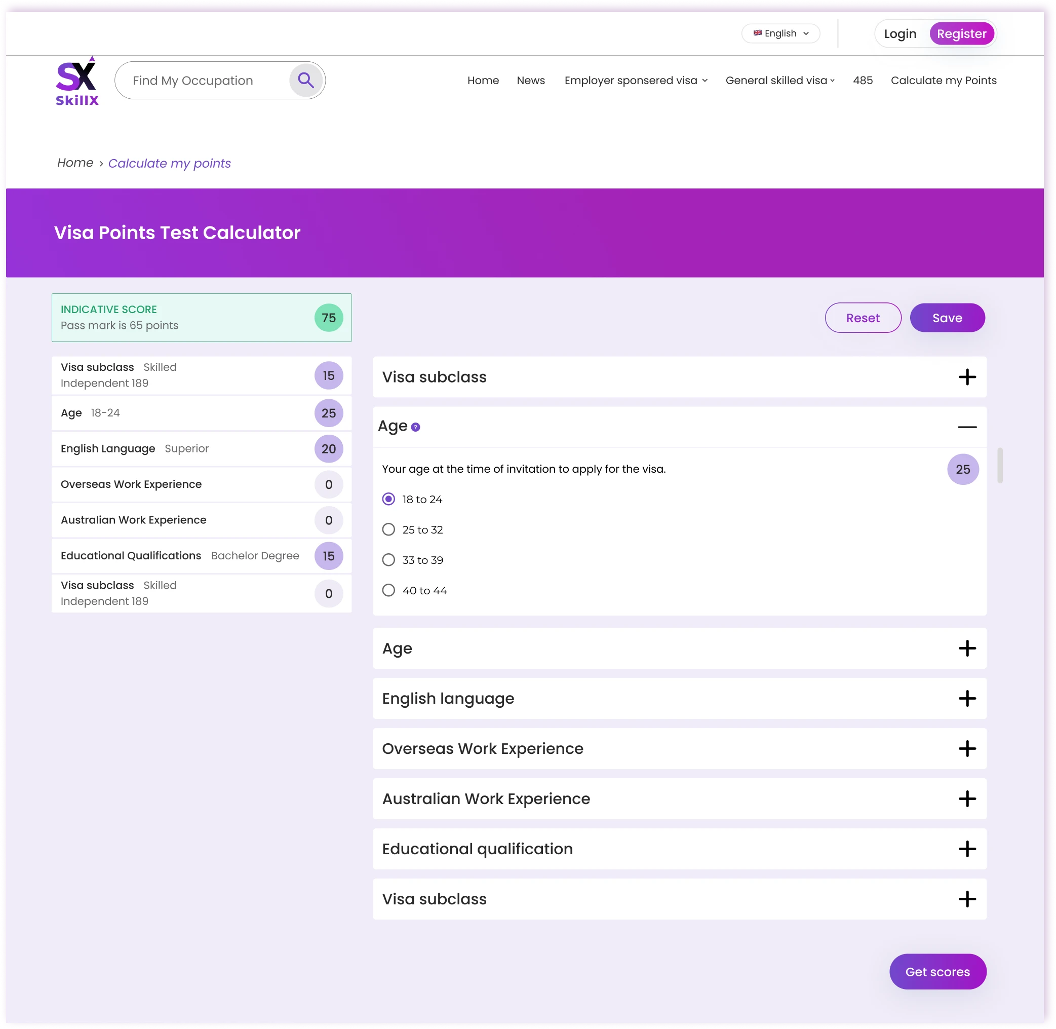
Connect points to the journey

Challenge

Points and eligibility are hard to understand.

Design response

I embedded a live points calculator into the assessment flow. As users answer questions, their points update in real time and eligibility status becomes visible immediately — turning an opaque calculation into continuous feedback.

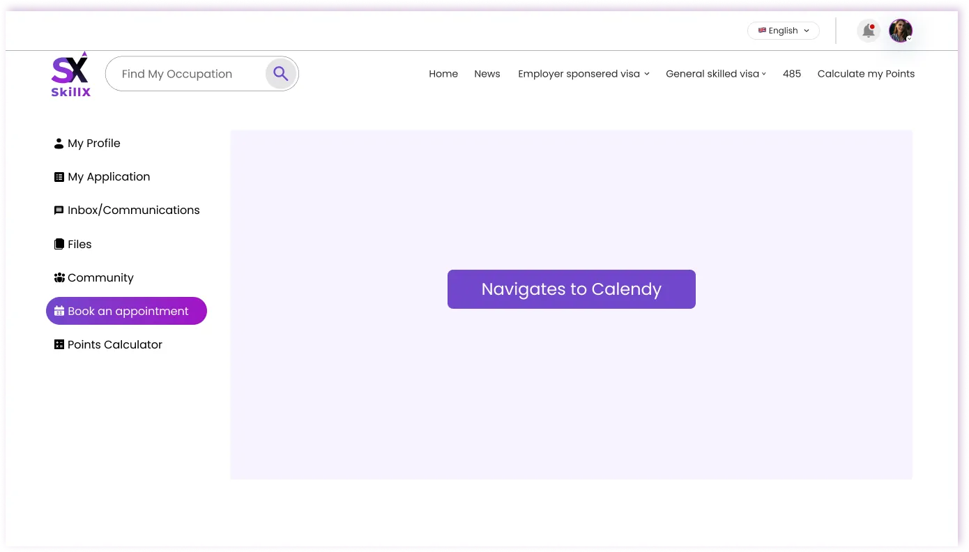
Response 05

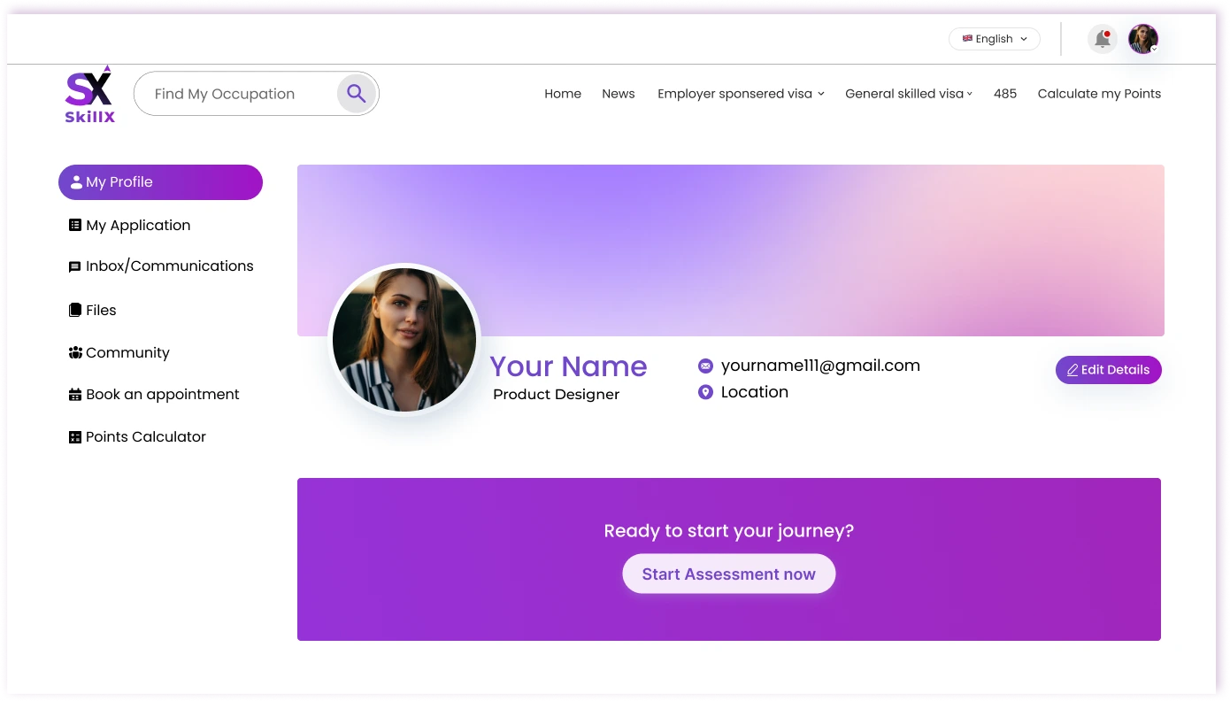
Give applicants one place to track progress

Challenge

Files, appointments, and messages are scattered.

Design response

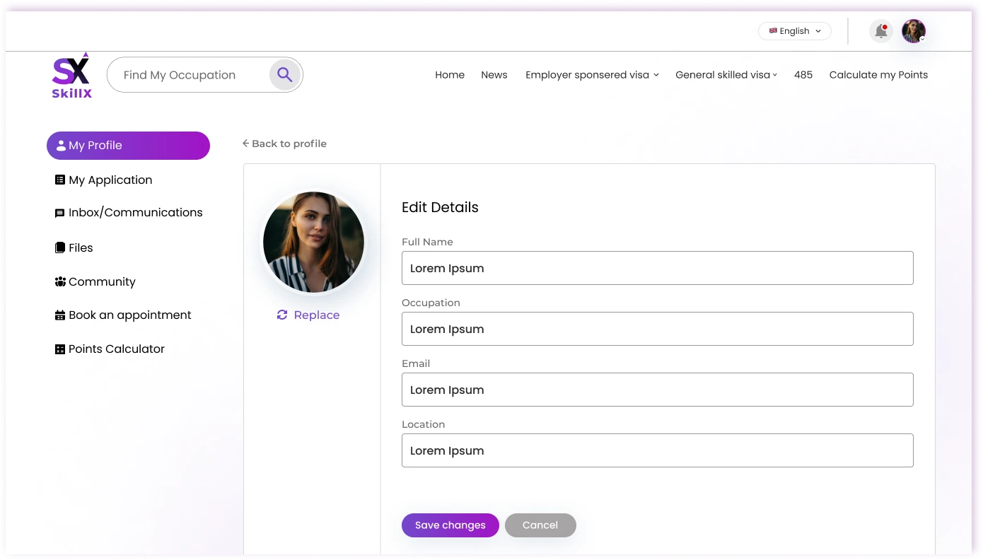
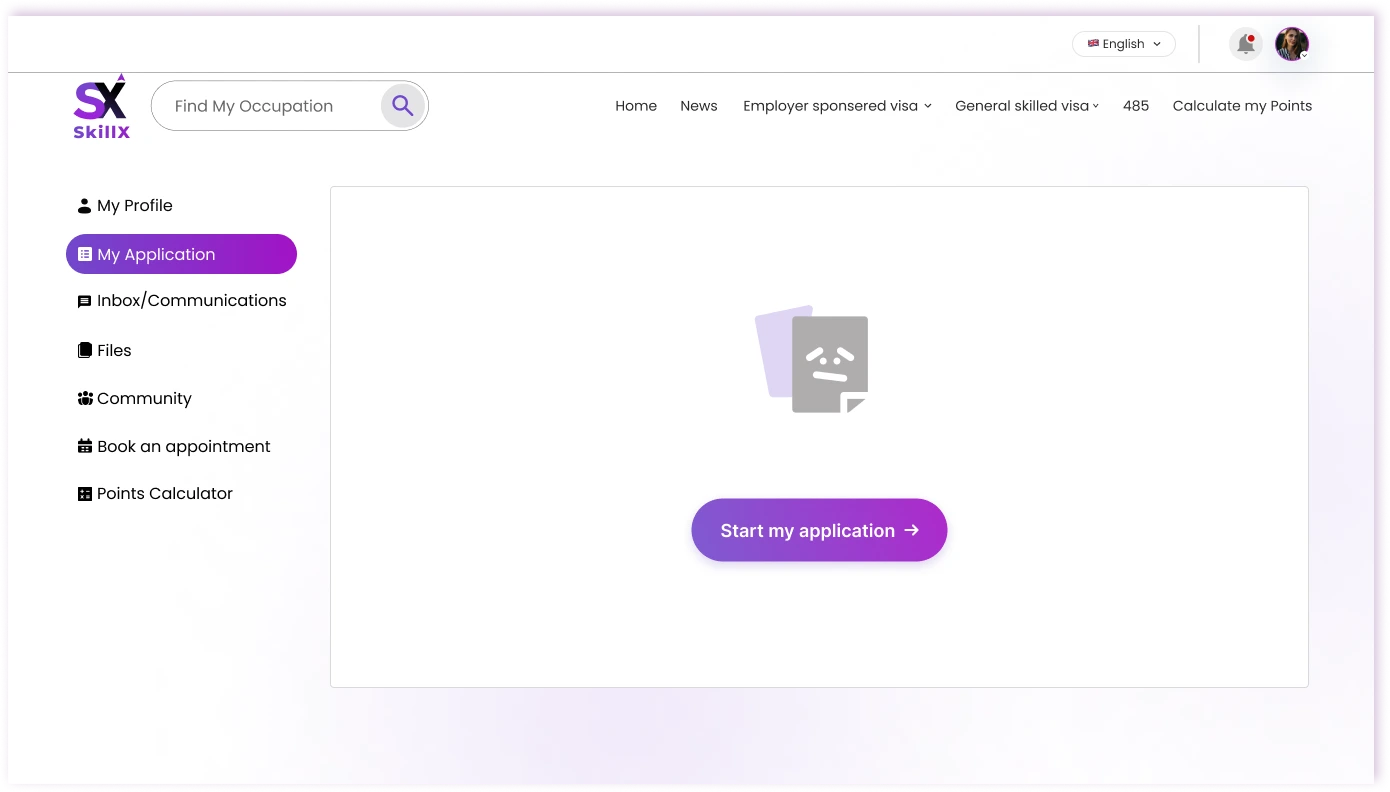
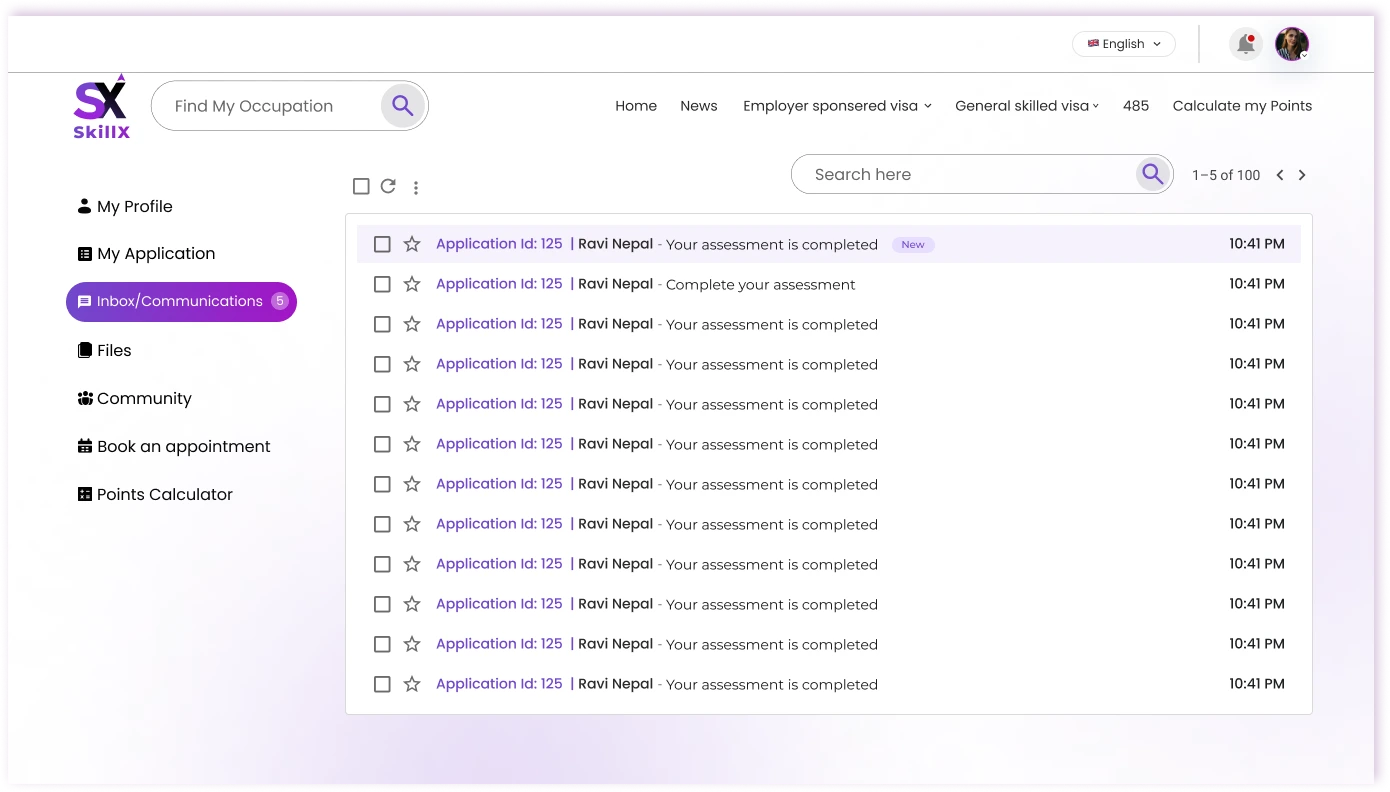
I designed a single applicant dashboard that surfaces current status, next required action, documents, appointments, and messages in one view. The goal was to eliminate the need to jump between tools or email threads.

Response 06

Give admins visibility into the pipeline

Challenge

Admins can’t see the whole pipeline, so delays surface late.

Design response

I created an admin pipeline dashboard that shows application volume, payment status, and activity at a glance. Stalled or incomplete cases are highlighted so the team can intervene early instead of reacting after the fact.

/Outcome

From complexity to clarity.

SkillX gives people a clearer path from finding an occupation to understanding eligibility and completing an assessment — with fewer decisions left to figure out alone.

  1. Simplified

    A multi-stage government process becomes a sequence of short, guided steps.

  2. Connected

    Applications, documents, messages, and progress live in one system for both applicants and admins.

  3. Clarified

    Live points feedback removes the guesswork around eligibility.

  4. Scaled

    One design system keeps the applicant experience, mobile views, and admin tools consistent.

/Behind the design

What shaped the design?

Research with applicants and operational staff revealed two very different but tightly linked needs. Applicants need continuous guidance through a high-stakes process. Admins need enough visibility to keep that process moving.

Understanding the people

Two groups sit at the center of SkillX. Applicants need a clear path through a high-stakes process; admins need enough visibility to keep that path moving.

Applicants

Skilled professionals navigating occupation discovery, assessment, points, and applications — often for the first time and under time pressure.

  • Know exactly where to start
  • Always see progress and the next required step
  • Understand how their answers affect eligibility in real time
Admins & agents

Operations teams managing applications, payments, and client communication across dozens of cases at once.

  • Pipeline health visible at a glance
  • Payments and activity in one place
  • Early signals when cases stall
Key insight: Applicants need guidance at every step; admins need visibility across the pipeline. The same underlying system has to feel clear and native for both groups.

User journey

01
DiscoverFind a relevant occupation
02
AssessComplete skills assessment
03
CalculateUnderstand points & eligibility
04
ApplyManage application & docs
05
TrackStay updated in one place

Information architecture

/ Visual direction

Logo

SkillX Logo · Light Logo · Light
SkillX Logo · Dark Logo · Dark

Typeface

Aa
Poppins

ABCDEFGHIJKLMNOPQRSTUVWXYZ
abcdefghijklmnopqrstuvwxyz
0123456789

AaRegular
AaMedium
AaSemiBold
AaBold

Color

Purple#6F18BB
Orchid#A434DB
Royal blue#184DBB
Gradient#A434DB to #184DBB
Ink#100114
Slate#344054
Muted gray#50565F
Lilac tint#FAE6FF
Canvas#FBF8FE

/Looking back

What did I learn?

Designing SkillX taught me that in high-stakes journeys, clarity matters more than feature volume. Every screen needs to answer one simple question: what does the user need to know or do next?.

Next, I would bring the marketing “How it works” journey even closer to the assessment experience and simplify the first view admins see when they log in.

/Let's work together

Let's bring meaningful ideas to life.

I'm currently open to remote and hybrid roles, freelance case studies, and product collaborations.